
The Upcoming Windows 10 Start Menu Is Looking Sleek
Last updated September 21, 2021
- Microsoft is in the process of redesigning the Windows 10 Start menu, and they’re teasing mockups on Facebook.
- The leaked designs look a lot sleeker and more distinctive than what we’re using on Windows 10 right now.
- Start Menus are somewhat outdated, but Windows users just can’t live without this crucial element.
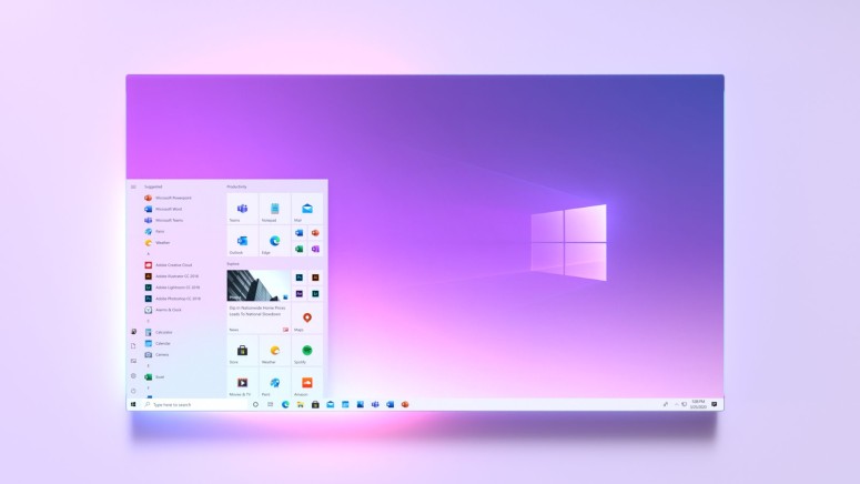
Rumors about a redesigned Windows 10 Start Menu have been raging during the past six months, and Microsoft has finally decided to leak a tease through its 365 Facebook account. The design of the screenshotted menu looks more modern, sleek, and glossy. The main difference -compared to the one that Windows 10 users rock right now - is that the refreshed design is more “alive” and less dull thanks to varied icon sizes. It has also achieved a compartmented look for the app drawer on the left, thanks to the shaded coloring. It just helps the user find what they need with a quick glance, which unfortunately isn’t the case with the current design.

Source: Microsoft 365 | Facebook
The Windows 10 menu stayed largely unchanged since 2015 when the new operating system was launched. Although it brought big improvements over the Windows 7 menu, it left most users with mixed feelings. When first launched, it looks bloated as hell, putting many people off. To make matters worse, the configuration settings are pretty limited, so bringing it to one’s specific tastes and needs is a rare achievement. Sure, there are unofficial tweaking tools available out there, but these come with their own sets of limitations and/or risks.
Of course, what is shared by the Microsoft 365 account on Facebook may not reflect the final design that we’ll get next year when Microsoft will roll out the Windows 10 redesign update. UI makeovers are tricky, and teams of designers engage in a lot of “back and forth” until they reach what they believe to be the optimal approach.
The Windows Start menu has been something that users of other operating systems call a generally outdated concept for many years now. It’s a signature navigation tool that many Windows users cannot imagine living without. Still, admittedly, there aren’t many good reasons to maintain its crucial role in the interface of the OS besides habit.
For example, macOS users have been enjoying the comfort of the Dock, while the Launchpad came to make things even faster almost eight years ago. Similarly, Linux users have been enjoying the GNOME Shell's expose mode with app searching and direct launching features since the release of GNOME 3.0 in April 2011. Start Menus in 2020 feel sluggish, uninspiring, and obsolete, but they are what most people think they need, so we’re keeping them.
Related


Get expert insights on threats, breaches, scams, and security trends — delivered every Monday.
Most Popular

Get expert insights on threats, breaches, scams, and security trends — delivered every Monday.
Most Popular