Microsoft Is Soon to Introduce Modernized Windows 10 Icons
- Microsoft is finally looking to update the File Explorer icons with a contemporary set.
- The new icons will be easier to tell apart and also more coherent across all Microsoft products.
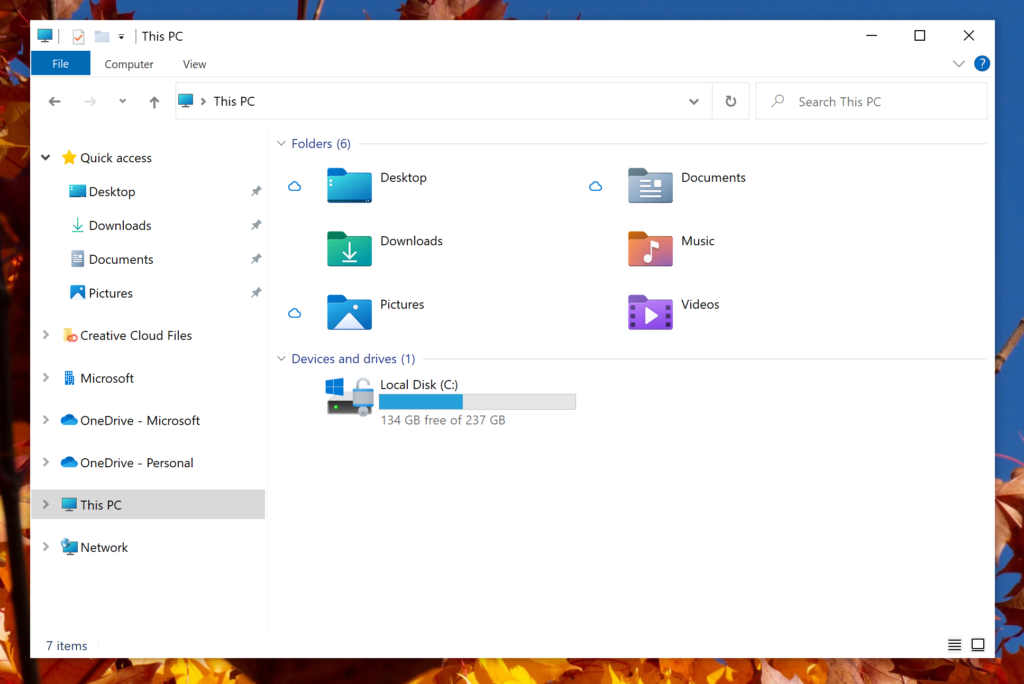
Microsoft has showcased an icon redesign for Windows 10, currently only available in the Insider Preview Build 21343. As the software giant explains, there’s an ongoing effort to overhaul all Windows 10 icons that started last month, and it will cover everything shown in File Explorer. To get an idea of the new look and feel, which is admittedly very refreshing, take a look at the following screenshot.
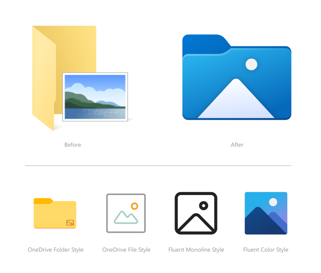
The changes concern the colors, orientation, and design language. Microsoft says their purpose wasn’t to just give them more contemporary looks but also to make them more consistent across all of the company’s products and make them easier to tell apart at a glance. The relevant post gives us samples of the new Recycle Bin, Disk, Pictures, and OneDrive Folder.
Cohesiveness in the UI design has always been a problem in Windows, and it’s good to see that Microsoft is putting some real work into this. Of course, Windows 10 users are free to install themes and icon sets from third-party websites.
Still, these aren’t perfect in the sense that they don’t cover everything, don’t work perfectly, and don’t look great in all possible resolution configurations. Also, since there’s no official tool to install these through, one has to use shady software or do it manually, which is a pain.
Other stuff announced in the same preview build includes the following:
- Better organization of the admin system tools in Windows 10.
- Improve file renaming in File Explorer with more key shortcut options.
- Account connection issues now send notifications directly to the Action Center.
- Introduce 30 new fixes on various components of the OS.
As for when to expect all that, there’s no standard answer to this as it depends on a lot of things. We would guess that we get to see the new icons land in the next six months. Mainly, this will depend on how rich the new icon pack will be. Possibly, Microsoft will let users choose whether they want to use the new set or just continue using the old one.


