Google Chrome Tries Out A New Look!
- Chrome web browser is getting a new look, expected to be fully released sometime this year.
- Google is calling it "Material Design Refresh".
- More details will be revealed at the I/O developer conference.
Google is teasing its users these days with a story of Chrome Web browser's fresh new look. It looks like the company is trying to adjust the looks of their browser to the new Gmail interface which is also being redesigned.
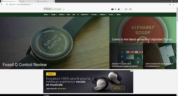
The new interface on Chrome gives us tabs with round corners. New concept includes the redesigned address bar which also has round edges. This makes more space on the toolbar itself, so the developers decided to put the account avatar icon next to it. They moved the plus button which opens a new tab to the far left side of the tab on Windows, Linux, and Chrome OS while it stays on the right side on macOS.
Image Courtesy of 9to5Google
The official name for this concept is the "Material Design Refresh". Developers aim to make it more touch-friendly. It is unknown if this new design is going to replace what everyone thought would be called "Material Design 2" earlier in April. On the first look, it sounds like Google trying to grasp the feel of Chrome OS. Users can see the new design if they are using Chrome Canary v68 for Windows or Mac.
First comments from users tend to agree on one thing - the change is a long overdue. Round shaped edges of elements should give a modern look to what is now considered robust and outdated design by many. Some say that, even though there was no mention of it, Chrome is in a desperate need for a proper dark theme. We have seen YouTube experimenting with a dark interface, so as far as that goes, all cards are on the table.
The Verge reports that Google will give us more details regarding Material Design Refresh in early May since that is when the next I/O developer conference will be held on.


